

I promise I am not writing these posts to show how awesome I am… because with Claude doing the heavy lifting it really highlights how lazy I am. I am just throwing these things out there in the hopes someone else will get inspired to save themselves some time.
I bet a lot of CAD/BIM/Whatever managers have a handful of things on their to-do list that have been on there a long time. Things that you know would take… weeks? months? to complete. One of those items on my list is state vicinity maps.
We have a couple. But nothing consistent. And it would be lovely to have premade loadable linework states with counties tied to parametric filled regions. Wouldn’t that be super?
And wouldn’t that take forever to do?
Spoiler alert: 4 hours. That’s it. I now have all 48 lower states as RFAs with labeled interstates, distinct county lines, toggles to highlight those counties, and a tiny little star on the state capital.
We Need Linework
Aside from it being copyright infringement, taking a screenshot of an internet-driven map sticks us with raster data. To at least start, I needed linework. And shoutout to Google’s AI driven search. Not only did it help me find out about QGIS, it showed me how to simplify the lines (in anticipation of Revit’s “that line is too short” error) and it gave me a python script to export each state’s outline, counties, and interstates as a single DXF. So we had the vector data.

Most strange new work that I am going to see if Claude can do, I run through it manually first myself to work out any possible bugs and have an example. Working with Alabama (alphabet!) I imported the DXF into a blank family to explode and clean up. It was HUGE. Like the actual size of the state. Did a couple of manual scales to get it to the size of the map “box” on the cover. Luckily, zero “line is too short,” errors.
I had my sample. It was time to start chatting with Claude.
Sweet Home Alabama
Working off my manual test, we iterated through 10 different runs and improvements in the process.
I was surprised that there was no “explode” accessible in the API, which actually led to a better process. After the import, Claude scaled and then read the geometry and rebuilt the linework from scratch. Much cleaner and easier to get rid of the import after.
Scale, positioning, all were straightforward. What was odd is the simplify tool in QGIS led to a lot of almost overlapping lines. Each county’s linework was simplified based on itself, so borders often went screwy.
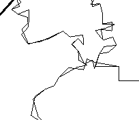
This is where I started getting pleasant surprises. I shared this exact image with Claude, described the “county by county” problem, and Claude did some digging. It found the not-simplified versions of the DXF and decided to work from those.
SO IT WENT AHEAD AND OPENED EACH DXF AND MADE NEW ONES THAT REMOVED THE SHARED BORDERS AND SIMPLIFIED THE LINEWORK. We started right off the bat with the right data.
The lines looked great.
Asking for Too Much – Not Really
That worked so well, I went for the crazy idea. A couple of the vicinity maps that the users had were built with filled regions around every county that they could toggle on to show the project site.
Could Claude do that? Again, it went digging. In that same folder was the original downloaded TIGER data… which had the county names tied to the shapefiles. The DXF had no county data, nor could store it, so it made a JSON file with the county name and position information that it could associate with the DXF.
Then, yeah. It drew the filled region shape… redraw them because the lines weren’t <Invisible> created a Yes/No parameter for each and then attached that to the visibility control of each county region. Then went back and toggled them all to off.
I am kind of flabbergasted
Just a Touch More
Interstate labels, Claude?
Sure. TIGER shape data had the interstate numbers. We just needed to build criteria for the labels (longer than 1″ segment… no more than 4 labeled per state… stay 3/4″ away from the state edge).
How about putting this little Star RFA on the capital, Claude?
Sure. Claude had to do some research for this one, since no TIGER data was included. Luckily it already knew the lat and long for the capitals, and it was able to place the stars based on that.
Let’s Do This Thing
As I said, several iterations with Alabama… and a quick decision to skip Hawaii and Alaska… and Claude started rolling.

Still using the MCP I developed, I let Claude go for it.
The smallest states took less than 10 seconds each. Most took between 30 and 90 seconds. Texas took the longest at 258 seconds. In the end this is what we ended up with (notes from Claude directly):
- Build time: 2,193 s, about 36.5 minutes, averaging 46 s per state. The slowest were Texas (258 s), Georgia (196 s), Pennsylvania (132 s), California (104 s) and Ohio (88 s).
- County fills: 3,050 filled regions behind 3,034 Yes/No parameters. There are more fills than parameters because some counties have several parts, such as islands. All 3,050 visibility links to parameters were made.
- Counties without a fill: 3, all Virginia independent cities (Emporia, Fairfax city, Galax).
- Interstate tags: 155 placed across the 48 states.
- Capital stars: 48, one per state.
- Detail lines: about 76,300 line segments, summed from the prep log (75,661 for 47 states, plus 685 for Wyoming, which was prepped separately).
- Failures: none. Wrong-style lines, failed fills, failed tags and failed lines were all zero.
- Revit dialogs auto-dismissed: 47. That’s the “extents greater than 20 miles” prompt, which appeared in all but one state.
Are they perfect? No! There are some odd gaps in the filled regions. Maybe 2 per state. And the Interstate tags could use a nudge. But the first time someone uses these, they can spend the 5 minutes cleaning that up and get it back to us to update.
It’s still an amazing amount of time saved, and more importantly, another item on the “we’ll get to it when we get to it” list done.
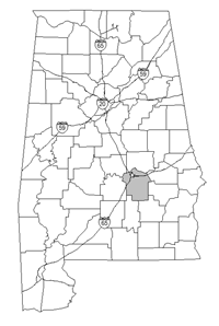
(There are 48 more like this)

